Posts

LOGO DESIGN FOR 'LANATIR' :AN ENVIRONMENTAL NGO

Image
Having been asked to do the Logo design for an NGO, I decided to to takle this task as if I am really creating my own NGO.Since I am someone who is extremely in love with the nature and the fact that climate change and other human-related activities are depleting Mother Nature, I came up with the idea of creating an environmental NGO that would help in combatting the scourges that our Nature is facing. The photos contains information about 'Lanatir' and the process gone by to create its logo design. Inspired by Lindon Leader's use of contrasting colours in his works,I decided to use green and red in my logo with the green representing the nature and the red colour representing the colours of the trochetia but mosly representing the danger our mother nature is having to deal with.I also added a simplified drawing of the Paille En Queue so as people know that the NGO not only caters for the flora but it also caters for the fauna. MOODBOARD RELATED TO THE NGO

MY TWO FAVOURITE GRAPHIC DESIGNERS

Image
1. Lindon Leader is a highly regarded American graphic designer who has a lot of recognition worldwide due to his two word design philosophy:simplicity and clarity.Some of his works consist of the logo design of Federal Express(fedEx),Hawaiian Airlines,Alesco,Cigna,Novariant.What attracts me the most about his works is the use of contrasting colours in his design which makes the works attractive .What I also like about his designs is the way how he is able to merge letterings and illustrstions(often portrayed in different colours)without affecting the balance of the composition. 2. Massimo Vignelli was a famous Italian graphic& industrial designer of the 20th Century.He has worked on several works of design such as furniture design,logo design,showroom designs and layout of warehouses.His works are mostly based on on simplicity& modernism which can be seen through his taste for the use of geometric designs in his works.What I find inspiring about his works is the way he merg...

Expressive Lettering with my name

Image
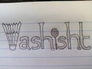
Having to express myself using the expressive lettering technique on my name,I decided to use something that I am really passionate about and which defines me therefore I used the sport 'badminton' by subsituting the letter 'V' by a shuttlecock and the letter'I'by a badminton racket in the work.

Expressive Lettering

Image
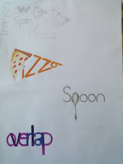
Having to do Expessive lettering with 3 words of my choice, I decided to express myself in 3 different ways by conducting the works in the following ways: I decided to work on the word 'PIZZA' by giving the whole illustration the form of a slice of Pizza and also by replacing the letter 'P' with a slice of Pizza, I then made use monochromatic colours to work on the word 'SPOON' alongside replacing the letter 'P' by a drawing of a spoon and lastly I used the word 'OVERLAP' rendering it with different colours so that when the colours overlap they would create new colours but still portraying the action of overlapping.